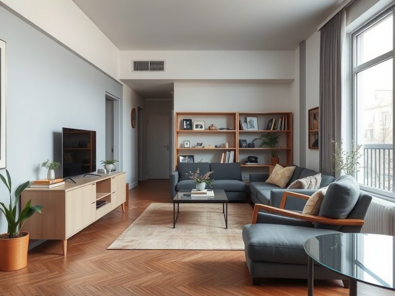


Accent color works best when it gives the eye a deliberate place to land instead of competing with every surface in the room. Start with the colors already fixed in the space, choose one main accent family, repeat it in a few separated locations, and test it under the room’s real light before committing.
TL;DR: Let floors, cabinets, upholstery, and large wall areas establish the base palette; use accent color in a smaller share of the room; repeat it with variation; and stop adding color once the focal points begin to compete.
Read the Room Before Choosing a Color
An accent should respond to the room rather than arrive as an isolated favorite swatch. Look at flooring, stone, wood, rugs, sofas, curtains, metal finishes, and adjoining spaces. These materials often contain warm, cool, muted, or saturated undertones that can guide the next color choice.
Benjamin moore’s interior color selection guidance recommends evaluating fixed elements and testing samples in the actual room because natural and artificial light change how paint appears. That is practical advice even if the accent comes from textiles rather than paint.
If the room already contains strong pattern, colorful art, or multiple wood tones, the most effective accent may be quieter. If the base is neutral and visually calm, a deeper or brighter accent can carry more weight.
Use Proportion as a Guide, Not a Law
The familiar 60-30-10 idea gives a simple way to think about balance: a dominant color takes most of the visual field, a secondary color supports it, and an accent occupies a smaller portion. Sherwin-williams describes this 60-30-10 palette approach as a balancing principle, not a building code or mathematical requirement.
In real rooms, the exact percentages are rarely measurable and do not need to be. The value of the rule is restraint. If your accent appears on the feature wall, sofa, curtains, rug, lamps, dining chairs, and accessories at once, it is no longer an accent; it has become a dominant color.
Use the framework to ask a simpler question: does the accent still feel special when you enter the room?
Pick One Lead Accent and Let Others Support It
A room can contain several colors without looking chaotic when one clearly leads. Choose a main accent, then allow one or two quieter related colors to appear in smaller ways. A deep green might be the lead accent while warm brass and muted clay play supporting roles.
Repeating the exact same shade everywhere can look overly coordinated. Instead, repeat the color family through different materials and values: a darker pillow, a softer throw, a small ceramic piece, or a plant with related tones. The connection remains visible without making the room feel packaged.
If you are working in a small room, this controlled repetition can also help avoid one of the common issues described in small-space decorating mistakes: too many unrelated visual signals competing for limited attention.
Give the Accent a Job
Accent color is easier to control when it has a purpose. It can frame a focal point, connect two zones in an open plan, draw attention to built-in shelving, highlight architectural trim, or make a neutral seating area feel more intentional.
Choose one role before adding objects. If the focal point is a fireplace wall, repeat that color lightly in two or three smaller elements elsewhere. If the accent lives mostly in upholstery, keep surrounding accessories quieter. When everything is designated a focal point, nothing reads as one.

Test Paint Where the Light Actually Changes
Paint chips are useful for narrowing choices, but a sample viewed under store lighting cannot predict a room. Put a large sample board or painted test area near different walls and observe it in morning light, afternoon light, and after the lamps are turned on. A color that looks crisp in daylight may become murky or intense under warm bulbs.
Also compare the sample with the fixed finishes that will remain. Countertops, flooring, and large furniture can make a color appear warmer or cooler by contrast. This is why choosing an accent in isolation often leads to a second round of shopping.
For renters, removable textiles and accessories can perform the same testing function before any paint decision. A throw, cushion cover, or inexpensive art print can reveal whether the color works with the room.
Avoid the Matching-Set Trap
Buying every accessory in the same accent shade is an easy way to overdo it. Matching vases, pillows, curtains, candles, and artwork can flatten the room because the eye sees repetition without hierarchy. A more natural approach mixes tone, texture, and scale.
For example, repeat a blue accent as a navy textile, a gray-blue ceramic, and a small patterned detail rather than three identical cobalt objects. The shared family creates cohesion while the variation keeps the room from feeling staged.
Texture can also carry visual interest when you want less color. Woven fibers, matte ceramics, brushed metal, natural wood, and linen create contrast without adding another hue.
Treat Accent Walls as Architecture
An accent wall is most convincing when the wall already has a reason to stand out: a fireplace, bed, built-in unit, window composition, or strong sightline. Painting a random short wall simply because it is available can divide the room awkwardly.
Before committing, look from the doorway and adjacent rooms. Ask where your eye naturally goes. If the chosen wall is interrupted by several doors or lacks a clear focal role, another surface or a furniture-based accent may work better.
You can also use a darker or more saturated trim color, ceiling detail, or built-in cabinet finish instead of a full wall. Accent color is a design tool, not a requirement to paint one surface differently.
Know When to Remove Rather Than Add
If the room feels busy, do not solve it by introducing a new accent. First remove or regroup small objects, then reassess. Often the underlying color scheme is fine but scattered décor prevents it from reading clearly.
This is similar to practical storage design: before installing new hardware, the guide to organizing under the kitchen sink starts by emptying the space and deciding what belongs. The same editorial eye helps with décor. Edit first, then add only what supports the room.
A useful test is to photograph the room in ordinary daylight. The camera flattens the scene and can make competing color clusters easier to notice than they are while standing inside it.
Let Personal Preference Stay Personal
Color preference is subjective. Some people feel comfortable in muted palettes; others enjoy maximalist rooms with many saturated hues. There is no objective rule that a bright wall is “too much” or that a neutral room is automatically more sophisticated.
The best practice is to separate functional guidance from taste. Testing colors under real light, considering fixed finishes, and creating a clear hierarchy are practical methods. The specific color, intensity, and mood remain personal choices.
Home and garden content is for informational and educational purposes only. Design recommendations are subjective and do not replace professional interior-design, structural, electrical, or legal advice.
Choose one room this week, remove two competing accent items, and test one intentional color family in three separated places before buying anything else.