
Small rooms usually feel worse when circulation, storage, light, and visual hierarchy are sacrificed in the effort to make everything “fit.” The most useful fixes are often subtractive: remove undersized clutter, restore clear pathways, use fewer better-scaled pieces, and let storage or color serve a clear purpose.
TL;DR: Do not automatically buy tiny furniture, push every piece against a wall, fill every vertical surface, use too many unrelated colors, or choose storage that creates more visual clutter than it removes. Measure the room and protect the way people actually move through it.
Mistake 1: Assuming Every Piece Must Be Small
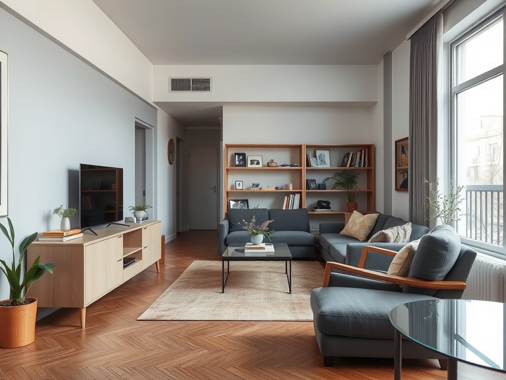
A room filled with many tiny pieces can feel more crowded than one with a few appropriately scaled items. A compact sofa with exposed floor beneath it, one useful side table, and a properly sized rug may create more calm than a collection of small chairs, stools, shelves, and accent tables.
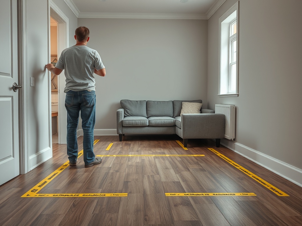
Scale is relative to the room and the function. Measure wall lengths, door swings, walking paths, and the footprint of existing furniture before replacing anything. Use painter’s tape on the floor to test new dimensions.
The point is not to buy oversized furniture. It is to avoid confusing “small” with “space efficient.”
Mistake 2: Pushing Everything Against the Walls
Wall-hugging furniture can leave a useless open patch in the center while making the room perimeter feel busy. In some layouts, floating a chair slightly inward, using the back of a sofa to define a zone, or placing a narrow console behind seating can make circulation more logical.
There are exceptions. A very narrow room may genuinely need most furniture against the perimeter. Treat this as a layout test rather than a universal rule. Walk the path from the door to the main seat, storage, window, and adjacent room. If you keep turning sideways or moving objects out of the way, the layout needs work.
Mistake 3: Using Storage That Hides Access
Deep bins, stacked boxes, and fixed shelves can technically hold a lot while making everyday items harder to reach. Storage is only efficient if you can access it without unloading something else first.
Choose drawers, pull-outs, open-front bins, or furniture with accessible compartments for frequently used items. The guide to adding pull-out storage without replacing cabinets shows how reach and visibility can improve even when the overall cabinet footprint stays the same.
In a small room, one closed storage piece can often do more visual work than several open organizers. Open shelving is useful, but it also keeps every stored object in the visual field.
Mistake 4: Adding Too Many Competing Colors
Color can make a small space memorable, but scattered accents with no hierarchy can make it feel restless. Choose a dominant base, a supporting color, and one lead accent family, then repeat them deliberately.
Benjamin Moore’s guidance on making small rooms feel bigger and brighter presents lighter colors and focal accents as options, while also acknowledging that design goals vary. Dark colors can work beautifully in small rooms when the intention is depth or mood rather than maximum brightness.
The practical mistake is not “using dark paint.” It is choosing color without considering light, fixed finishes, and the visual role of the room.
Mistake 5: Treating Every Wall as Storage
Vertical storage is often recommended for small spaces, but covering every wall with shelves can create a boxed-in feeling and leave no visual rest. Use height strategically: one tall bookcase, a well-proportioned cabinet, or a focused wall system can be more effective than many small shelves.
Keep heavy objects stable and consider anchoring tall furniture where needed, especially in homes with children. The cpsc’s anchor it safety guidance emphasizes securing top-heavy furniture and televisions to help reduce tip-over risk.
Safety is not a style preference. If vertical storage changes the center of gravity of a unit, treat stability as part of the design decision.
Mistake 6: Buying Organizers Before Decluttering
A basket for every category can turn clutter into organized clutter. Before buying bins, remove duplicates, expired items, broken décor, and things that belong elsewhere. Then choose storage for the volume that remains.
This approach is especially useful in kitchens and bathrooms, where small organizers multiply quickly. The same principle drives under-sink organization: empty the area first, decide what belongs, and only then choose containers.
If the room looks busier after adding storage, the storage is not solving the visual problem.
Mistake 7: Ignoring Door and Drawer Swing
Small spaces punish measurement errors. A bedside drawer that hits the bed, a cabinet door that blocks a walkway, or a dining chair that cannot pull out comfortably turns a good-looking plan into daily friction.
Measure furniture in its open and in-use state, not just its closed footprint. Mark drawer extension, chair pull-back, reclining depth, and door swing with tape. Also check whether a robot vacuum, wheelchair, walker, stroller, or other household equipment needs a predictable path.
Comfort and accessibility needs differ by household, so prioritize the people using the room over generic layout diagrams.
Mistake 8: Using One Harsh Light Source
A single bright ceiling fixture can leave corners dark and make a small room feel flat. Layered lighting can provide task light where it is needed and softer ambient light elsewhere. A floor lamp, wall sconce, under-cabinet light, or table lamp may improve function without adding much footprint.
Electrical safety and rental restrictions matter. Do not overload outlets or create trip hazards with extension cords. Hardwired sconces should be installed according to local electrical requirements, and plug-in fixtures should be positioned so cords are protected.
Lighting also changes color perception, which is why the guide to using accent colors without overdoing it recommends testing color under the room’s actual daytime and evening conditions.
Mistake 9: Forgetting Empty Space Is Useful
Not every corner needs a plant, basket, table, or lamp. Empty wall area and visible floor help separate objects visually and make movement easier. This does not mean a minimal style is objectively better; it means the room needs some unclaimed space to function.
If you enjoy maximalist décor, cluster collections intentionally rather than distributing small objects evenly across every surface. Grouping creates a stronger focal point and leaves quieter zones elsewhere.
Build a Small Room Around Its Main Job
A studio apartment may need several functions, but each zone still benefits from a primary purpose. Decide what the room must do first: sleep, work, host guests, store equipment, or support family routines. Give the largest and most comfortable pieces to that priority.
Secondary functions can use flexible furniture, folding pieces, nesting tables, movable carts, or storage that serves more than one role. Multi-use furniture is valuable only when each function is genuinely convenient; a complicated transformer piece that is never converted is just bulky furniture.
Better Small-Space Design Is Usually Less Reactive
The biggest decorating mistakes happen when purchases are made one at a time without a measured plan. A new shelf solves one problem but blocks a door. A small chair fills an empty corner but reduces the walking path. Extra baskets hide clutter but add more visual objects.
Measure first, define the room’s main job, protect circulation, then add storage, color, and décor in that order. The result does not need to look minimal, pale, or trendy. It only needs to make the available square footage easier to live in.
Home and garden content is for informational and educational purposes only. Design suggestions are subjective and do not replace accessibility, structural, electrical, fire-safety, landlord, or legal advice.
Photograph your smallest room from the doorway, mark the three areas that interrupt movement or create visual clutter, and fix those before buying new décor.